Refreshing Wyndham’s Member Experience
When I began leading creative and design work for Club Wyndham, they had just started a brand overhaul. I helped evolve their guide for the assets my teams were responsible for which included video content, a new member portal, email, social, and more.
It started by reimagining the onboarding experience with the creation of a new brand video I wrote and concepted that set the stage for what it means to be a part of Club Wyndham. The long version is here, but we cut it down to :60s, :30s and :15s for advertising and paid social.
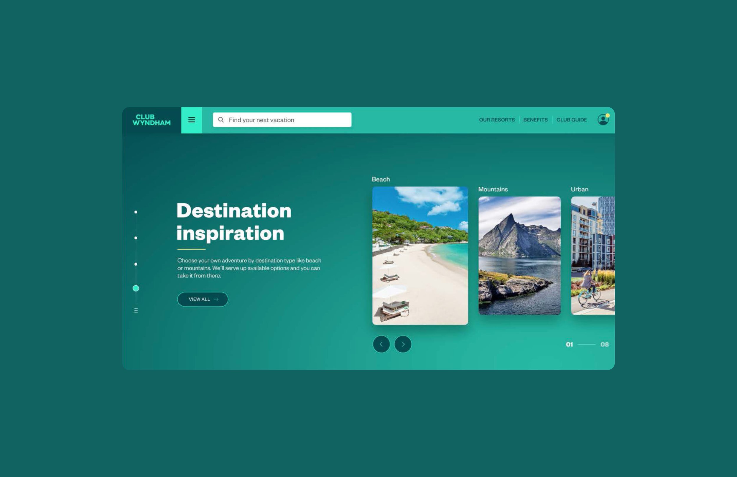
Then, I led the charge in reimagining their website experience. Through research, we found that members were highly unsatisfied with the experience as it was very difficult to book high demand locations. Read further and you’ll see how I approached the redesign from a UX, UI and brand standpoint to achieve a successful new site.
A better user experience.
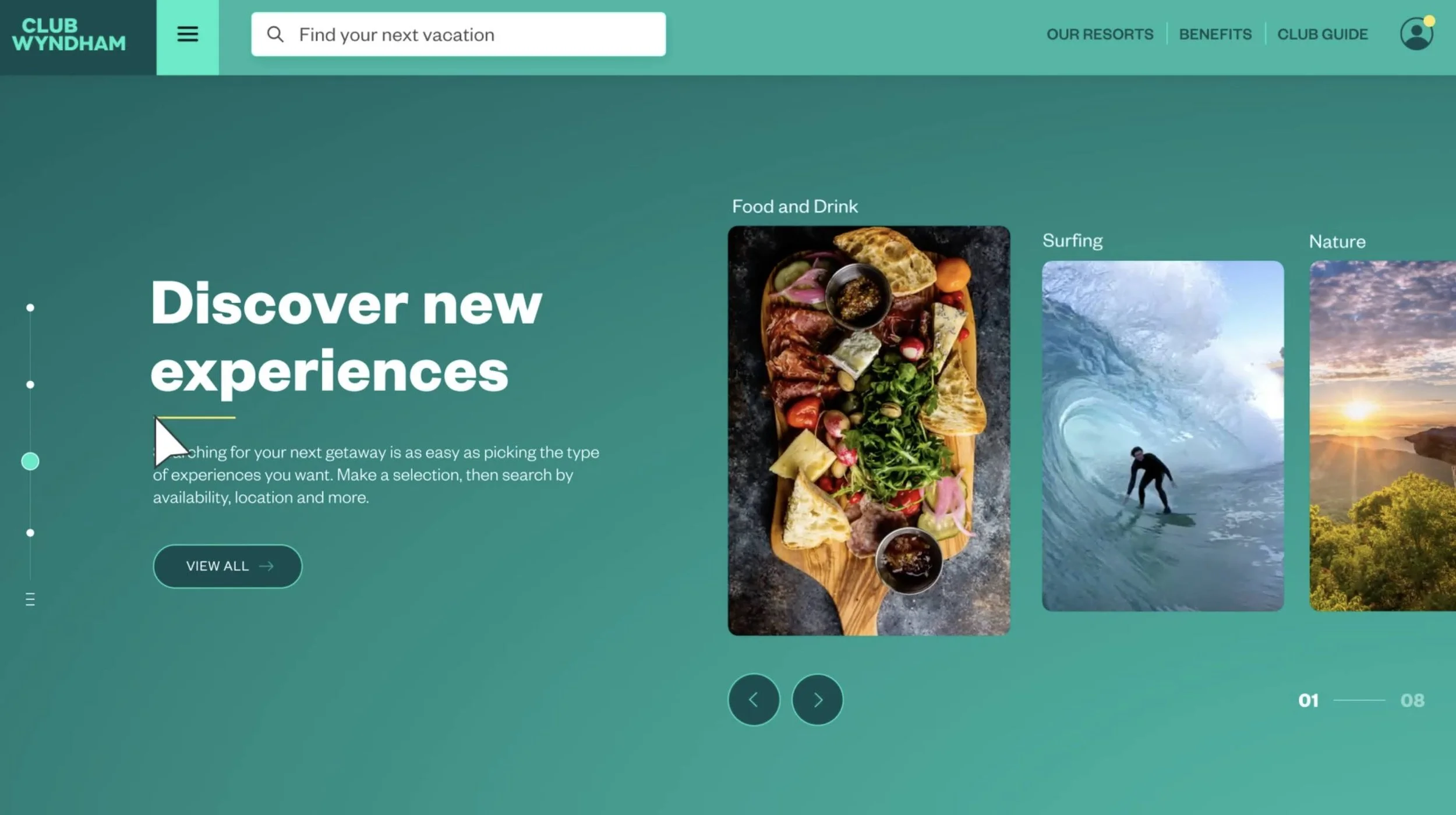
First, I helped leverage and evolve aspects of the new brand to help formulate the brand guide for web and content. Then I helped craft the journey and flow of the new portal experience with my interactive team. New members were unable to find trips to popular destinations due to the fact that favorites destinations were often booked up to a year in advance. We focused on gathering members’ preferences to ensure they found a destination they wanted to book the first time they logged in.
A better booking experience.
We designed a better booking experience based on user preferences and more in the style of a streaming platform. The idea was to be able to make a bucket list by selecting experiences, destinations and themes for vacations that would then serve up available recommendations. This new strategic approach guaranteed a new member would find a trip they loved that they could book within the next 90 days. The booking site can only be viewed by members, so this video shows how it worked.


